Visualizations#
Diagrams#
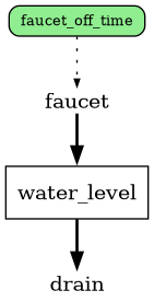
Stock and flow diagrams are a useful way to visually check that component references are
set up as expected, with corresponding lines between flow, variables, and stock
based on what other equations they’re used in. The basic method for generating a
stock and flow diagram is the model.graph()
function, which as shown on the getting started page might look something like
this:
Highly complex stock and flow diagrams with lots of components can be challenging to interpret
when everything is rendered. The graph function has a variety of parameters
to control what references get included in the final output, prioritized by the
following:
Individually listed references included in either
showorhidelists.Group names passed to
show_groups/hide_groupslists.Bulk component flags with
vars(Trueby default, displaying all variables) andmetrics(Falseby default, hiding any metric components.)
Note that in all show/hide groupings, hide takes precedence over show.
For example, if a model has dozens of variables, and only one group of them
should be shown except for one specific variable in that group, one could
combine all three of the vars, show_groups, and hide like so:
graph = my_model.graph(
    vars=False,
    show_groups=["variable_group_of_interest"],
    hide=[my_model.hide_this_variable_in_group_of_interest],
)
Highly linear models that don’t have many branches or cycles can be oriented
left-to-right instead of top-down by passing lr=True.
Sparklines#
Mini “sparkline” plots can be added to the sides of various component types
within the stock and flow diagrams to quickly get an overview of component values
in the context of where they sit in the overall system. Which components get
sparklines is controlled by the *_sparklines flags (var_sparklines,
flow_sparklines, stock_sparklines, and metric_sparklines), or
individual references can be listed in sparklines.
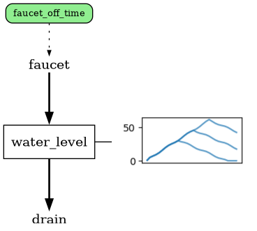
Running with stock_sparklines=True will add a sparkline plot to every stock in the
system:
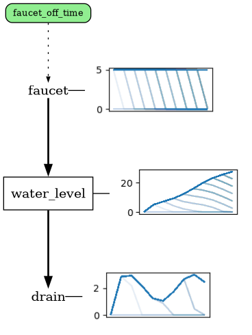
flow_sparklines=True will further add plots for every flow:
Variables that have probability distributions with them will render as
histograms/density plots if static, or collections of timeseries if dynamic,
included with var_sparklines:
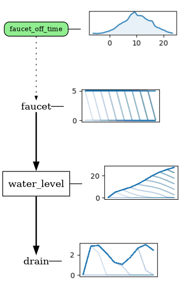
By default, the sparkline plots will be based on the last simulation run that
completed. To use specific runs or render multiple runs at the same time, pass
the traces to the traces array parameter.
Groups/Color groups#
Every tracked reference optionally has both a group and cgroup attribute, which influences how they
appear in the diagrams. The group attribute is used to encourage graphviz to
visually tighten up/keep elements within the same group closer to each other.
This is primarily done by straightening and shortening any connections between
elements of a group where possible.
In this example, suppose a variable applies to two different flows:
import reno as r

m = r.Model()
with m:
    s1 = r.Stock()
    v1 = r.Variable()
    f1, f2 = r.Flow(v1), r.Flow(v1)
    f1 >> s1 >> f2
The stock/flow diagram looks like this:
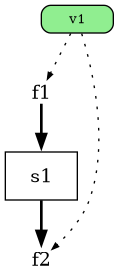
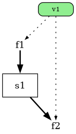
If we assign the same group name to the variable and the second flow, it
straightens out the connection between v1 and f2:
import reno as r

m = r.Model()
with m:
    s1 = r.Stock()
    v1 = r.Variable(group="test")
    f1, f2 = r.Flow(v1), r.Flow(v1, group="test")
    f1 >> s1 >> f2
cgroup is a “color group” attribute intended to make it easier to change
colors of specific sets of references in the diagram without influencing layout.
Either groups or color groups can be colored from a model.graph() call with the group_colors attribute:
m.graph(group_colors={"test":"#4499AA"})
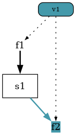
Settings can be defined on models to hide specific groups or set default colors for designated groups, making them potentially easier to interpret when given to someone else.
These settings can also be specified manually on a model.graph() call with the hide_groups, show_groups (to override a model’s default_hide_groups setting), and group_colors.
Get a list of the groups/cgroups on a model with the groups property.
Universe#
To limit diagram rendering to only a specific set of components (beyond just
hiding certain variables), directly pass a list of tracked references to include
in the diagram to the universe parameter. This is useful if a very large
system has multiple “areas” and you want to individually render each area
separately.
Latex#
As shown on the getting started page, an interactive latex output listing all
component equations can be generated with the model.latex() function:
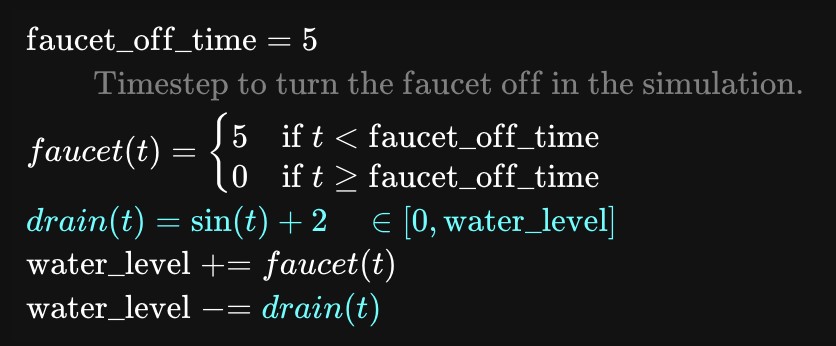
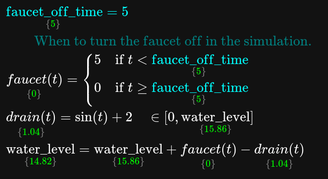
The latex view can also be useful for debugging systems by passing a t
parameter - this will include the values of every reference at the specified
timestep:
tub.latex(t=5)
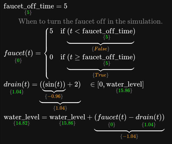
This can be taken one step further by including debug_ops=True, which will
additionally use under braces to show the evaluated output at every single
operation:
tub.latex(t=5, debug_ops=True)
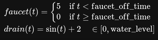
Note that you can selectively render only a specific set of reference equations
by passing a list of strings and/or component references with the ref_list
parameter:
tub.latex(t=5, ref_list=["faucet", tub.drain])
Plots#
Multi-trace plots#
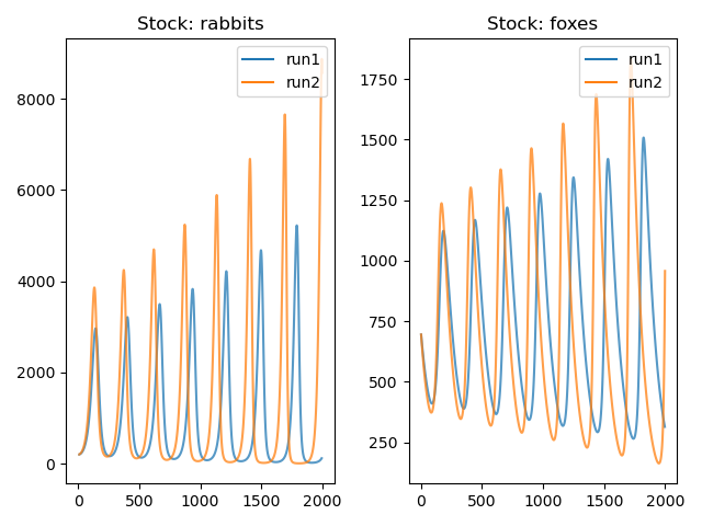
The reno.viz.plot_trace_refs() function allows comparing specified
components across multiple different simulation runs.
trace1 = predator_prey(
    rabbit_growth_rate=0.07,
    rabbit_death_rate=0.0001,
    fox_death_rate=0.01,
    fox_growth_rate=1e-05,
    rabbits_0=200.0,
    foxes_0=700.0,
    steps=2000
)
trace2 = predator_prey(
    rabbit_growth_rate=0.071,
    rabbit_death_rate=0.0001,
    fox_death_rate=0.012,
    fox_growth_rate=1e-05,
    rabbits_0=200.0,
    foxes_0=700.0,
    steps=2000
)
reno.plot_trace_refs(
    predator_prey,
    {"run1": trace1, "run2": trace2},
    ref_list=["foxes", predator_prey.rabbits]
)
Single axis plots#
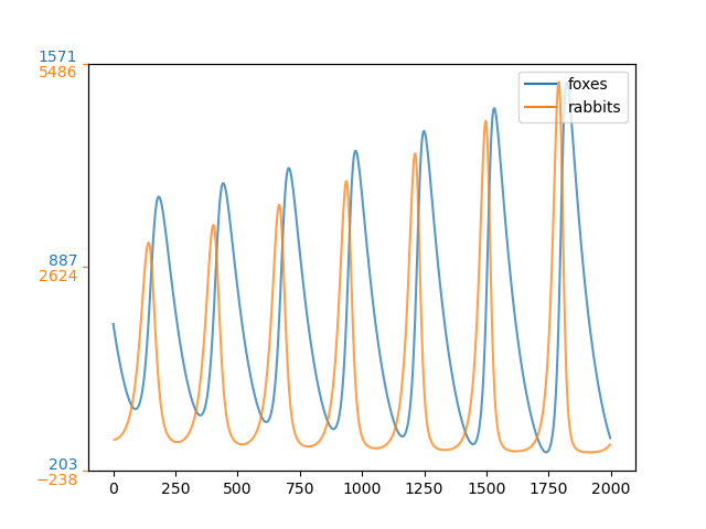
A common figure type used for system dynamics models compares multiple
components on the same plot axes. The logic for labelling the axes is a bit
tricky, so reno.viz.plot_refs_single_axis() handles it for you:
(Note this can only handle rendering from one trace/simulation run at a time.)
reno.plot_refs_single_axis(trace1, [predator_prey.foxes, predator_prey.rabbits])